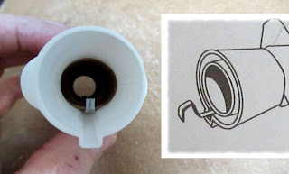
Notice the light pencil center line. This gives you a visual center spacing for the right and left decals.
The nose cone decals (shown below) are the reason I drew up new water-slide decals. A thick sticker won't lay flat or conform to the curvature of the nose cone. Ask anyone who has ever used the stickers on the nose cone of this model.
I should have set the right and left side of the stars decals closer together on the bottom of the nose cone. (See last decal at the bottom of the post.)
Looking on from the bottom -
Set the right side of the stars first,
After that, place the center landing gear decal.
TIP: Set the landing gear decal farther back than I did so the two sides of the stars decals could be closer to the center.
Then set the left side of the stars decal.
The stars "arc" decal goes over the top front, almost joining into the blue stars on the right and left side decals.
I didn't use all the "sponsors" art, like the M&Ms and 7up decals.
Three reasons -
1. The model décor is busy enough already.
2. I couldn't find the correct current art online.
3. I don't have permission to use the logos.
I did my best to set all the round "window" decals but didn't have enough room for one window on each side.
I did my best to set all the round "window" decals but didn't have enough room for one window on each side.
Mentioned above - The right and left star decals (Pictures 2 & 3 above) should have been set farther down and closer together. That would have gave me enough room.
No one will know the difference.
If you are a Patreon supporter, I can send you the PDF to home print your own decals.
Email me at oddlrockets@bellsouth.net and ask for the Estes Space Ship One decal PDF.
Notice: The black decals don't appear as a full opaque black.
This is most apparent when setting a black ink home print decal over white paint.
You could use two layers of the same decal to get a full black color.
This isn't as noticeable with other ink colors set over white.


