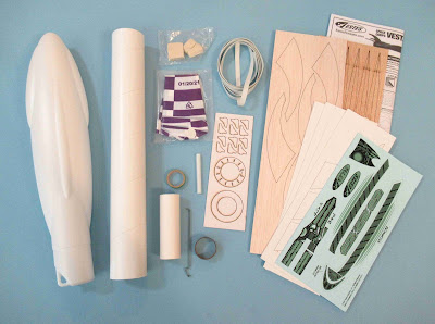
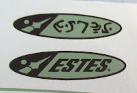
It looks like Estes is using that new font throughout the product line packaging.
The tall (four raised canopy) nose cone is about as long as the body tube.
Two pats of clay weight.
Laser cut card stock fin overlays.
Why is the second "E" in ESTES different?
Silly aliens.


The nosecone is indeed interesting (looks sort of like an insect head to me), looks useful for "alien-looking" models (like the one from the "Alien Invader" kit). Star Wars fans will probably say it looks sort of Mon Calamari ( https://starwars.fandom.com/wiki/Category:Mon_Calamari_starship_classes ).
ReplyDeleteAs for the "alien" Estes text, not only is the second "E" different, but the second "S" appears to be rotated.
Hi Naoto,
DeleteI'm sure the Estes designers get their inspiration from many sources. I can see some "Calamari" lines in the nose cone.
The S is rotated, but the Es are two different shapes. It is clever, even with the letters flipped or turned you can still read the Estes name.
Perhaps the aliens pronounce it "Ess-teez"?
ReplyDelete"Why is the second "E" in ESTES different?"
ReplyDeleteIt's because one's an upper case E and the other is a lower case E.